
Vice Media
The challenge is to create a consistent design language for illustrations that head the new Vice Editorial section articles. Create three sample articles editorial illustrations, one animated which will define the future news graphics.
The Articles


Initial Concepts
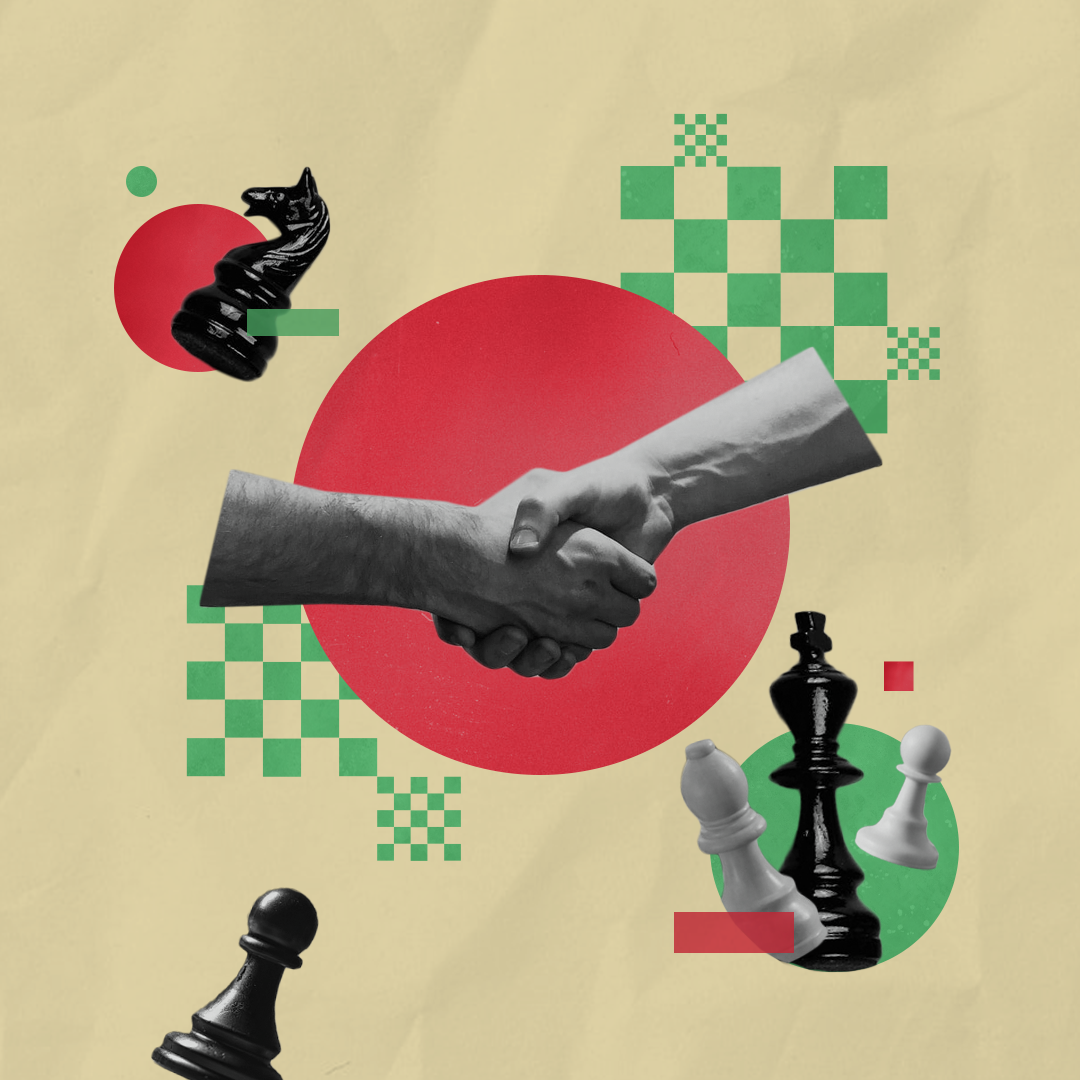

Concept 01 Collage
A mixture of graphic elements using greyscale images and colorful shapes to create this design approach.
Concept 02 Pop Art
Inspired by the style of Pop Art, this direction will showcase drama and dynamics. Using bold, saturated primary colors and emphasizing the importance of the article is the concept behind this direction.
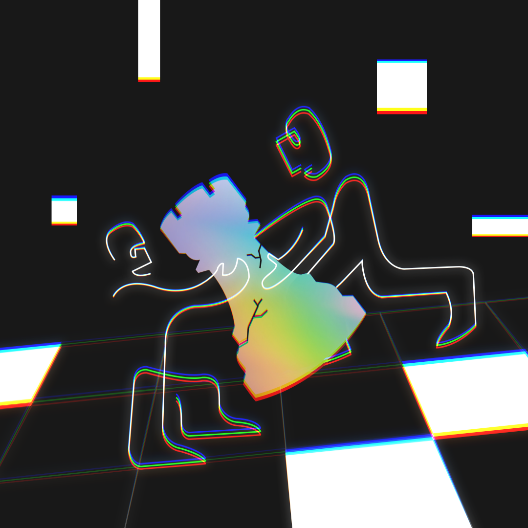
Concept 03 Cyber
Creating this abstracted black and white space where one element will be highlighted with gradients. This ties back to the brand as well since Vice is known for their black and white logo/visual language. Illustration will be finalized with chromatic aberration to connect back to digital media.
Concept Development
Concept 03, Cyber, was chosen to move forward because it had the least amount of ambiguity compared to 01 and 02. The notes that were applied were to change the chess piece from a Rook to a King since that’s the piece that wins the game. Also, the next step is to illustrate the next two articles in the same visual language.
First Pass
Second Pass


For the second pass, when it came to the ‘Tiebreaker’ article the notes applied were to have the characters demonstrate more of a struggle when it comes to fighting over the King; along with having one character seem like they’re winning over the other. This change will help communicate a clear message in the illustration.


For the second pass of the ‘Content Bot’ article, the notes were to scale up the background character a bit and have more overlap. Also, to highlight the box and not have it feel like a random dot.


As for the “Demanding Justice in Mexico…” article, the drawing was too ambiguous. It needed to have more parallels of journalism and gun violence, so it was back to the drawing board from here!
First Pass Animation
iPhone Mockups


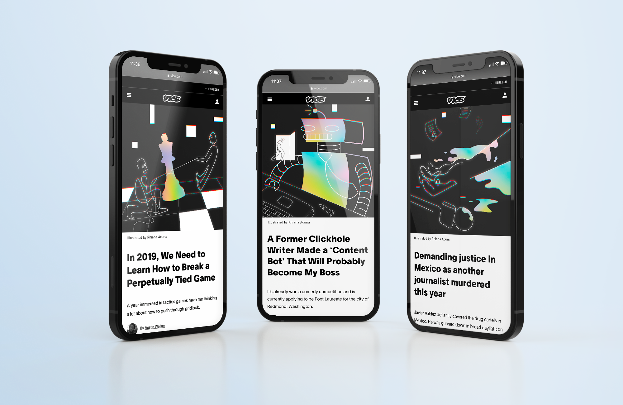
Final Pass
For the final pass, we have all three articles in a mockup and 1 being animated. The design language is to have a dark background with white, linear artwork to create the figures or other elements to create the design. Gradient texture is added to one subject and this will help highlight the protagonist/antagonist of the article.